
Website for a Loan Advisor or DSA Firm: Built for Borrowers and Partners
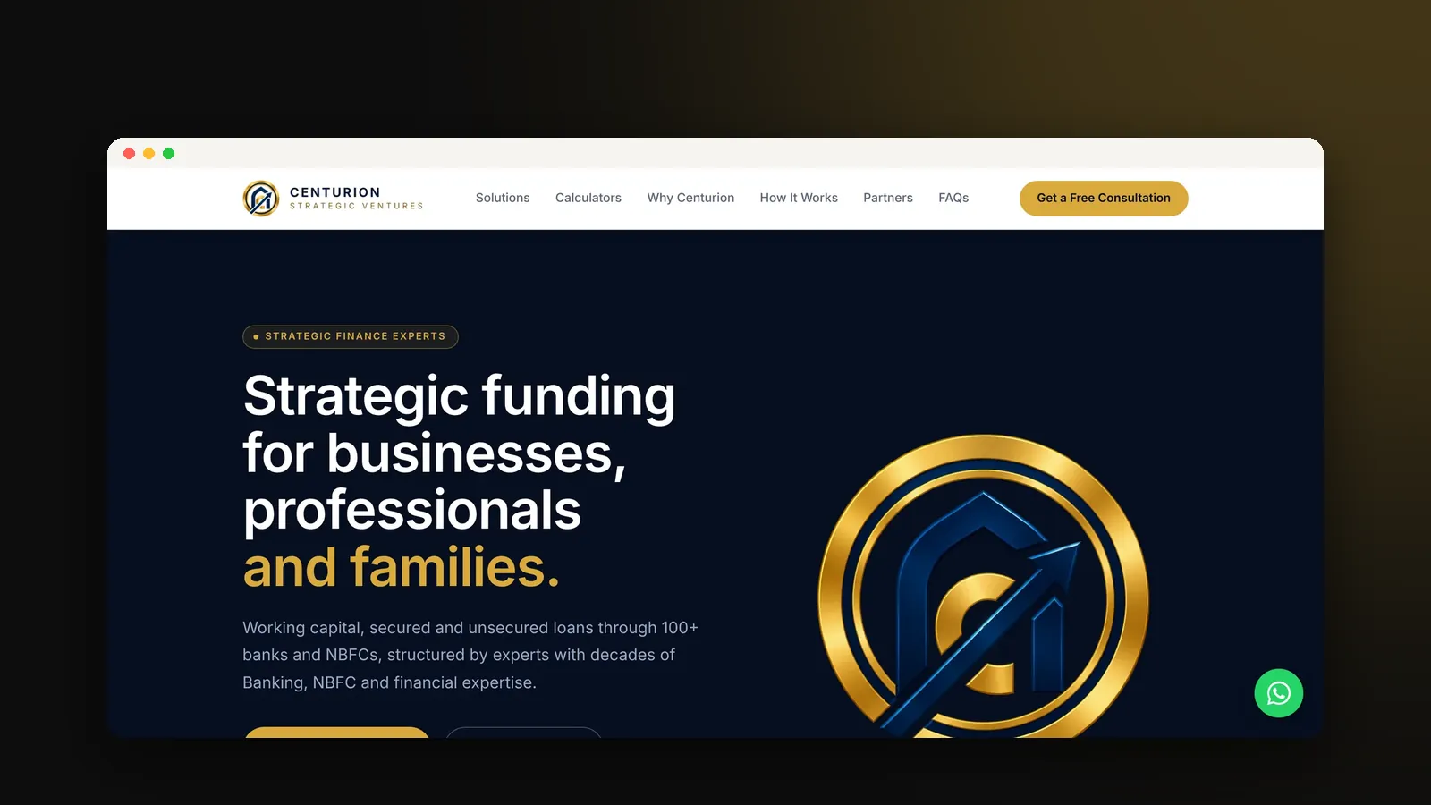
A website for a loan advisor or DSA firm must look established, speak plainly about money, and serve two very different visitors: borrowers who need funding, and partners who could send you business. Calculators, a clear view of the people behind the firm and a simple way to talk to an expert turn a nervous visitor into an enquiry.
Centurion Strategic Ventures is a loan advisory and debt syndication firm in Ahmedabad, led by directors with 20+ years inside India's leading banks and NBFCs. They were launching a brand new name. We built their website from the ground up. Here is what it needed, and what any finance or loan advisory firm can learn from it.
The problem: new name, crowded market
Loan advisors are everywhere, and most of their websites look the same: stock photos, long lists of loan types, and big promises about approval. A new firm has no reputation online yet, so it has to look credible from the very first day.
Centurion had a second challenge. The site needed to speak to borrowers looking for funding and to DSA partners who might refer clients. Put both on one generic page and neither feels spoken to.
What a loan advisory website needs
1. Position as a partner, not another agent
We positioned Centurion as strategic finance partners rather than another loan agent. The copy stays calm and free of jargon, and reveals detail gradually instead of dumping every product on the homepage. In finance, a quiet, confident tone builds more trust than bold claims.
2. Separate paths for borrowers and partners
Borrowers and partners have different questions, so they get their own clear path through the site and their own enquiry flow, each going to its own inbox. Borrower enquiries reach the right person fast, and partner conversations do not get lost among loan requests.
3. Calculators that answer the first question
Before a borrower talks to anyone, they want to know: can I afford this, and am I likely to qualify? We built EMI and eligibility calculators into the site. A visitor can check their numbers in a few taps, which builds confidence and brings in better-qualified enquiries.
4. The people behind the firm, front and centre
Experience is the strongest asset a new advisory firm has. A directors section puts their banking and NBFC background front and centre, so a visitor understands within seconds that this is a team that knows how lenders think.
5. A fast route to a real expert
Finance questions feel personal and often urgent. A WhatsApp shortcut alongside the enquiry forms lets a borrower reach an expert without filling in anything long.
6. Fast and premium on a phone
Most borrowers start on their phone. The site is built to load fast and feel premium on a small screen, because a slow, cluttered page makes any firm look careless with money.
The result
Centurion launched looking like the established firm its directors' experience says it is. Borrowers can check their numbers and reach an expert in a few taps, and partners get a clear reason to work with them. Their director's verdict on the project: prompt responses, open to feedback, and changes handled without any issues.
Read the full Centurion Strategic Ventures case study.
A quick checklist for your loan advisory website
- Does your site speak separately to borrowers and partners?
- Can a visitor estimate their EMI or eligibility without calling?
- Are the people behind the firm, and their experience, clearly shown?
- Is the copy calm and free of jargon and big promises?
- Can someone reach you on WhatsApp in one tap?
Want a website like this for your firm?
We build websites for consultants and advisory firms, designed from a blank canvas around how your clients decide. Get a free website audit, or see our website packages and pricing.